

SUMMARY
I chose the "Terrain with Labels" basemap. I chose this basemap because it looked clean and easy to work with. I also liked that it provided me with some landscape names and a few points of reference. I think a lot of different layers will work with this basemap because it is clean and simple. There aren't a lot of areas/terrain labeled.
Looking at the income, I discovered the following:
Highest Block Group: More than $82,000
Lowest Block Group: $24,000 or less
It appears to me that the housing around the trolley line are low income. I would assume this has to do with the location of the trolley line. Typically, a trolley line is going to be located where there isn't a lot of elevation change. Which means that it is built on a flatter surface. Homes with higher income have a tendency to be on more dynamic elevations. Another reason for this would be that higher income homes seek to be built away from such urban activity.
According to the map, the Trolley Line that runs parallel to a fault line is the BLUE LINE. By the way, Mission Valley was created, in part, due to this fault line. It is by the Pacific Plate fault line.
Maps and Web Apps show different types of information. The WEB APP that I opened was the mapping for the recent Oso mudslide. The information that this map showed was the addresses of those that are deceased and those that are missing. I like the unique information provided by the web apps and the detailed information provided by the maps.
The webapps map showed more specifics for the earthquake faults. I think that the webapps map would be best for publication and display.
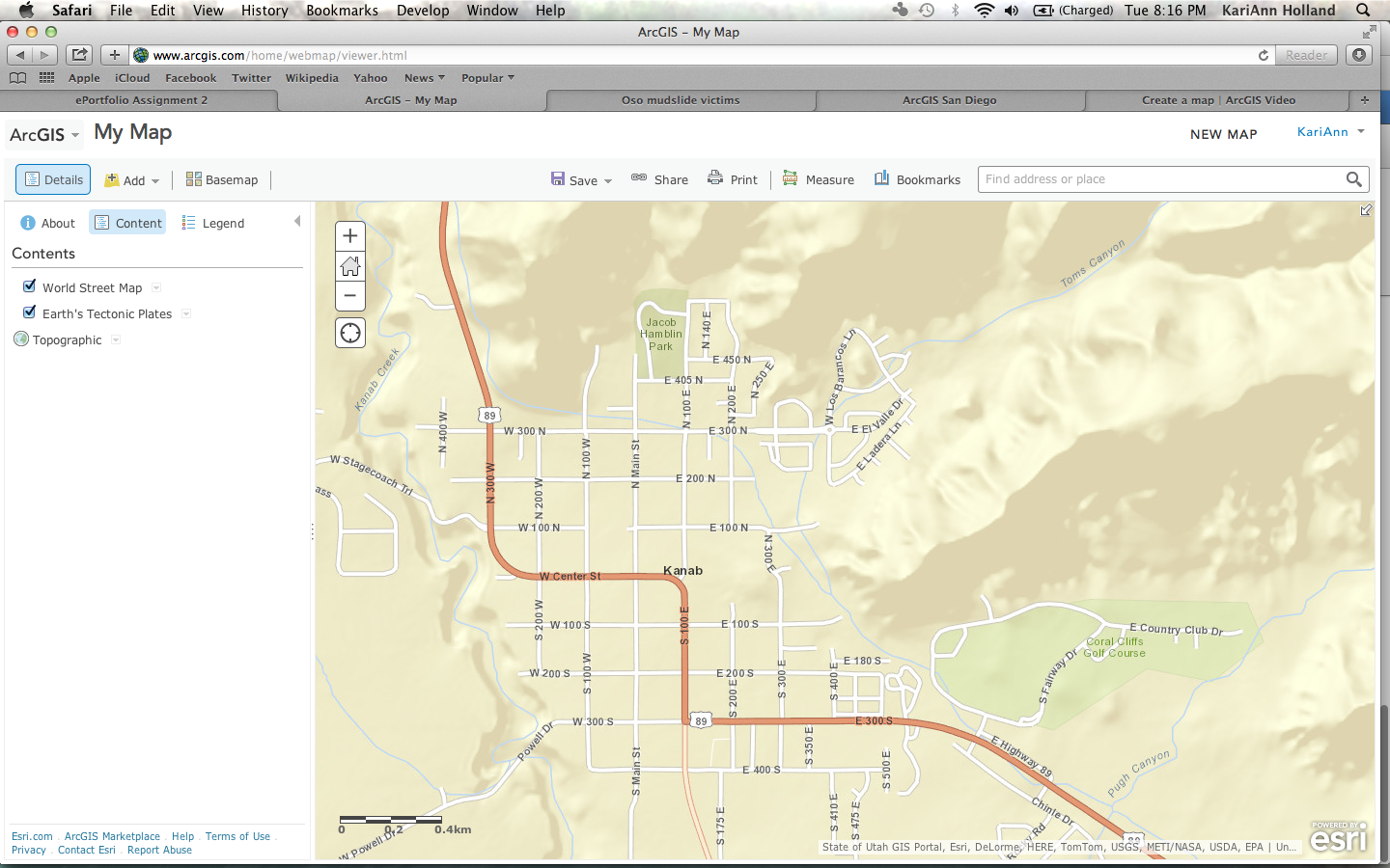
The URL of my map is: http://bit.ly/1inHwmP
My map is of Kanab, Utah. I chose the layers tectonic plates and elevation. I used the topographic as the base map.
The URL of my web application map is:
http://www.arcgis.com/apps/Elevations/index.html?appid=4a021c3a3dbf46c3ab30fb161415e69a
I chose the elevation template for my web application. The differences between the web application and map is that the we application can show more detailed information as far as elevation is concerned.
Reflection
I absolutely loved this assignment. I had heard of the ArcGIS website but wasn't sure how it worked. Although I learned a lot from this assignment, I am sure I only hit the "tip of the iceberg" with learning about how things work on this site. But I am happy that I learned what I did. I think that the layering is quite amazing. I am going into a geology profession so learning about mapping is very helpful for me.
The information on the maps I created could definitely help first responders be better prepared for disaster. For example, on the map of San Diego, you can easily see the fault lines. This helps first responders in knowing where to look for victims in the event of an earthquake. It will also help them know how to navigate around the landscape and what areas are subject to moving. The map I created of Kanab is a topographical map. This particular map would be helpful to first responders. The topography clearly shows where there are valleys and mountainous regions. Looking at this from a more broader perspective, the ArcGIS website would be extremely helpful in assisting first responders all over the world. The layers tools are amazing and would help anyone decide plans of actions to take in the event of an emergency. I plant to continue to learn more about this website and how to look at map layers. I would like to learn about the area I am in so I can be better prepared for an emergency.